Earthquake Early Warning System Demo Maps - September 5, 2015
The following maps are based upon information released after the Napa quake suggesting 7 seconds of warning time would have been available at the epicenter if the system had been in place. I requested confirmation for this mapping purpose and have not received a response, thus I suggest an error allowance of +1 second.
The following maps offer an eyeball view of how many miles per second of warning time may be afforded to us and provide a better understanding as there may some confusion in regard to timing based upon a host of news articles that have not yet demonstrated the system or particular quake scenarios.
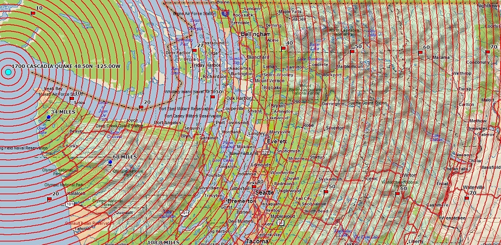
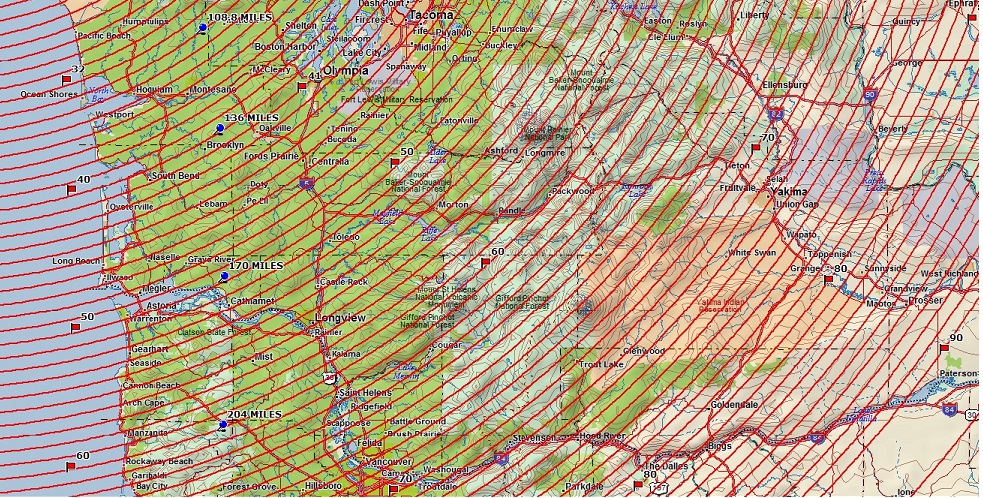
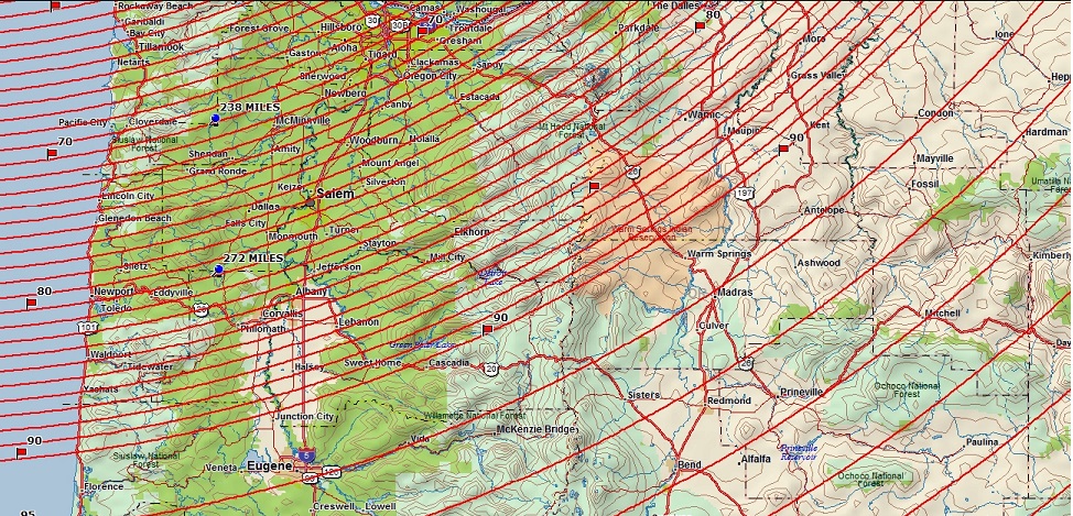
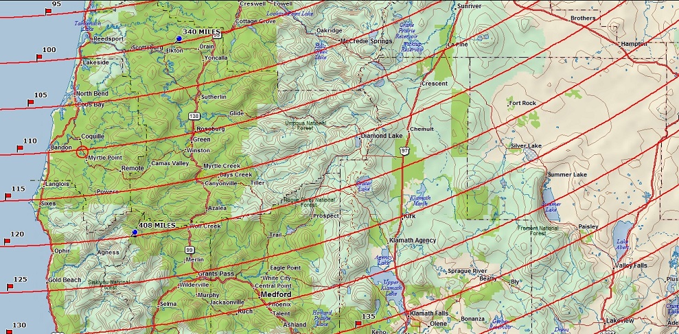
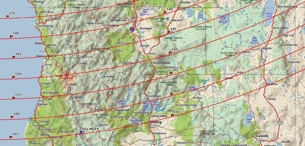
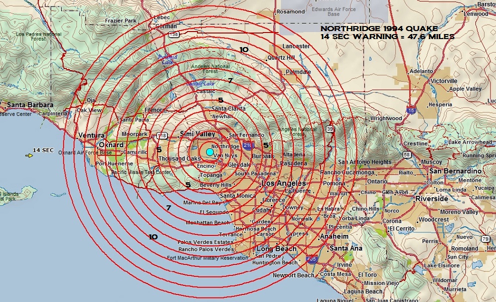
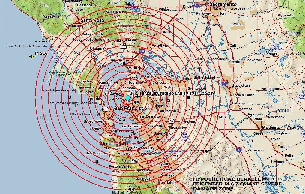
Simply due to curiosity I've included several maps covering a replay of the 1994 Northridge earthquake most severely damaged area and a hypothetical map for an M 6.7 quake originating on the Hayward Fault near the Berkeley Seismo Lab covering the area that would be known to cause the most severe damage, though it could be wider than demonstrated, and several maps covering a reply of the M 9.0 1700 Cascadia earthquake from Washington to very Northern California. [If necessary to zoom in, press Control and the + sign].
However, we must keep in mind the system may not be fully activated for another three years and at present the quake notification system at times reports erroneous earthquakes which trip the system, so as to whether false alarms could occur in the future it's unknown at this time.
CASCADIA 1700 - Red Flags = Seconds ~ Blue Pins = Miles